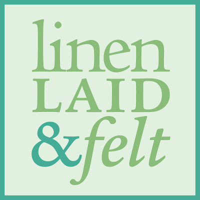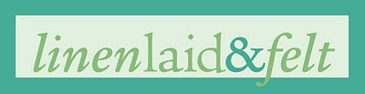
I started working on some logo designs for linenlaid&felt this weekend, and I've come up with two different variations that I think are working pretty well so far. I recently updated the banner for my Etsy shop so it includes the square version, and it's also the new profile picture for my facebook fan page. The rectangular logo is now incorporated into the header for this blog.
What do you think about the logo designs so far? Do you like how there are two different versions that can be used in different instances, or is that confusing? Any general thoughts about the type, colors, etc? I'd love to get some feedback before I design and print business cards for myself.
What do you think about the logo designs so far? Do you like how there are two different versions that can be used in different instances, or is that confusing? Any general thoughts about the type, colors, etc? I'd love to get some feedback before I design and print business cards for myself.